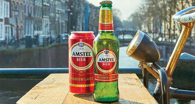
Amstel has unveiled a new pack design as part of increased overall investment in the Heineken-owned brand.
The revamp, which aims for a more premium look and feel, includes a new red design and a modernised logo.
The change to red branding across the range provides greater consistency with Amstel’s wider brand identity across Europe.
The re-design comes as part of increased investment into the brand, which will see £7m spent across TV, cinema and social media.
Nic Casby, Brand Unit Director, commented: “Amstel is a well-loved premium bier with a strong point of difference, attracting more and more affluent drinkers year on year. This, combined with its higher price point, benefits retailers who choose to stock it. As such, we are committed to putting significant investment behind Amstel for 2018, driving consumer awareness around the brand.
“The new pack design, which will be supported by scalable activations in store and a new campaign later in the year, is testament to this support.”