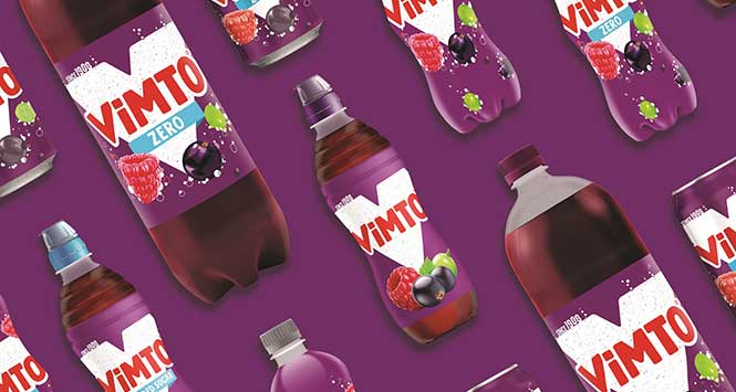
Vimto has launched a new visual identity across its entire portfolio.
The contemporary design delivers a cleaner, bolder and more modern look that Vimto said represents its “unique and refreshingly different brand personality”.
Centred around a striking ‘V’, the new design pays homage to Vimto’s 113-year heritage with the inclusion of ‘since1908’ as well as the brand’s iconic red, white and purple colour palette.
Becky Unwin, Senior Brand Manager for Vimto said: “The new modern design stands out on shelf and enables us to highlight more of our product benefits, such as real fruit ingredients and added vitamins.
“The redesign for Vimto marks the start of what will be an exciting year and we can’t wait to reveal what we have in store.”