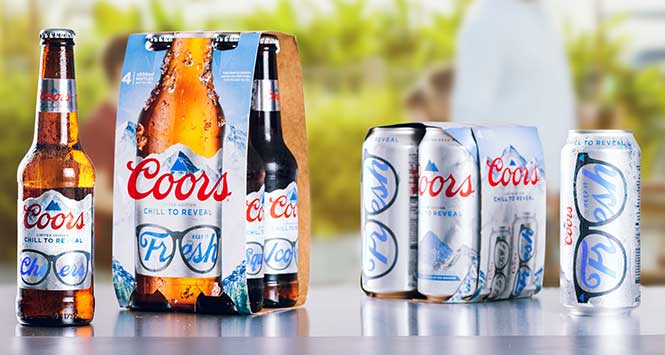
Molson Coors has launched new limited-edition packaging to “highlight the ice-cold refreshment of Coors this summer”.
The brand’s packaging already makes use of thermochromic ink, which turns the mountain peaks on all Coors bottles and cans blue when the beer is cold enough to drink. The seven new packs feature a word hidden behind a pair of sunglasses that will be revealed across the full length of every bottle and can when they are sufficiently chilled.
To support the launch, a nationwide out-of-home and social media campaign with a range of influencer partnerships will run throughout the summer alongside in-store activity.
Lee Willett, Brand Director at Molson Coors, said: “The label that shows you when your beer is cold enough to drink is an iconic feature of the Coors brand, accentuating the mountain cold refreshment that underpins our lager, and the crisp and light flavour profile that people know and love. These limited-edition designs, which are available just this summer, bring this to life even more.”
The limited-edition bottles and cans follow on from a multi-million pound rebrand of the product, which saw it renamed to Coors in 2021.