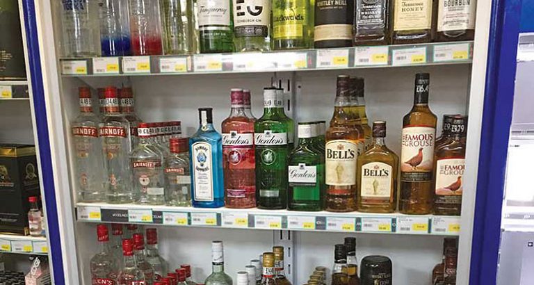
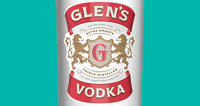
Glen’s Vodka has undergone an image refresh to strengthen its market position, with clearer quality and heritage messaging.
In the first modifications made to its branding in over eight years, Glen’s has refreshed the packaging design across its full product range to improve shelf standout and quality cues.
The new packaging highlights the brand’s heritage, featuring a new shield logo and detailed illustrations, while quality is also better reflected with bolder and more visible typography and a brighter and more vibrant colour palate, including the label’s glossy metallic gold finish.
John Grieveson, Chief Marketing Officer of brand owner Loch Lomond Group, said: “A bolder brand with better standout gives us the opportunity to create greater product recognition and generate more colourful communication off-pack with a wider consumer base, especially with new product development in the pipeline.”
Glen’s 70cl & 1-litre packs featuring the new branding are appearing now, with its wider product range – including its 20cl & 35cl bottlings – following suit over the coming months.