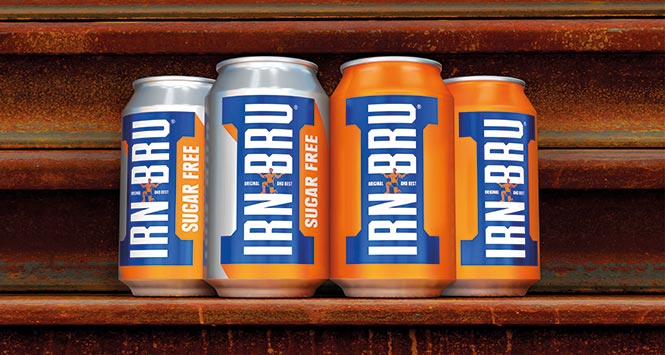
Irn-Bru is to receive a new look, for only the eighth time in over 100 years.
Updated bottles and cans, which nod to the brand’s history and heritage, roll out from March 2016.
Looking to its past, Irn-Bru’s new designs reflect the brand’s most iconic symbol – the girder – but with an up to date, modern twist. Original strongman, Adam Brown, is also appearing on packaging; a real tribute to the brand’s history.
Although the packaging will look different, the Irn-Bru blue and orange colours remain – ensuring a strong standout and unmistakeable identity.
Adrian Troy, Head of Marketing at Irn-Bru, is looking forward to seeing cans on shelves:
“Girders are such a strong part of our heritage, we knew we had to have them front and centre on our packs. The new designs really modernise Irn-Bru but stays true to our roots – Irn-Bru is a brand built on strength and power. The packaging is iconic and stands out and ensures Irn-Bru’s position as Original and Best. We love the new look and we’re excited to see them in stores.”
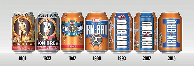
The story behind the designs is as follows:
1887: Robert Fulton Barr opened a soft drink business in Glasgow.
1901: Iron Brew was born. The drink was actually created to quench the thirsts of steel workers working on Central Station and help get them through a hard day’s graft. Due to the restorative and uplifting qualities of the drink, Iron Brew was endorsed by many sportsmen of the time. Images of Adam Brown from Shotts, a Highland athlete with a glorious moustache, were added to packaging.
1922: Artwork was changed to include imagery of another sportsman; the Cambridge rower, carrying on the brand’s reputation of strength and braun.
1947: The Irn-Bru brand was born. Packaging was brought up to date with a new can format (news which made front pages of newspapers) and the Cambridge Rower stayed present.
1988: The first ‘Made in Scotland from Girders’ adverts were launched in Scotland and featured iconic landmarks including the Forth Rail Bridge. The can design was updated once more and a new molten man design was added – a subtle nod to the previous sporting characters who appeared.
1993: A new design was introduced with the brand name placed vertically for more impact. The molten man design was made sleeker and more modern.
2007: The design was modernised for the noughties – cleaner, simple lines but still retaining the brand’s strength and heritage.