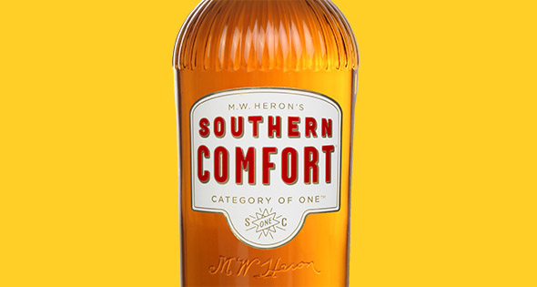
Southern Comfort has refreshed its packaging design. The new look bottles, which roll out imminently, have been designed to reflect the brands heritage and its ‘Whatever’s Comfortable’ brand positioning.
The bottle features a star icon placed on the neck and label with the word ‘one’ in the centre, and has the same fluted shoulders of previous designs. Colours and typeface have been updated, while high embossing and gold accents aim to deliver a premium finish.
The new packaging attempts to offer great on-shelf stand out and keep the brand front-of-mind amongst 18-24 year olds.
Southern Comfort Marketing Manager Gwen Ridsdale, commented: “Our vision was to create a bottle that told the story of Southern Comfort in a more contemporary way yet still celebrated the brand’s rich heritage. We believe the new design has embodied the confident personality and values of the brand and will help to recruit new consumers and revolutionise the way consumers drink and retailers stock Southern Comfort.