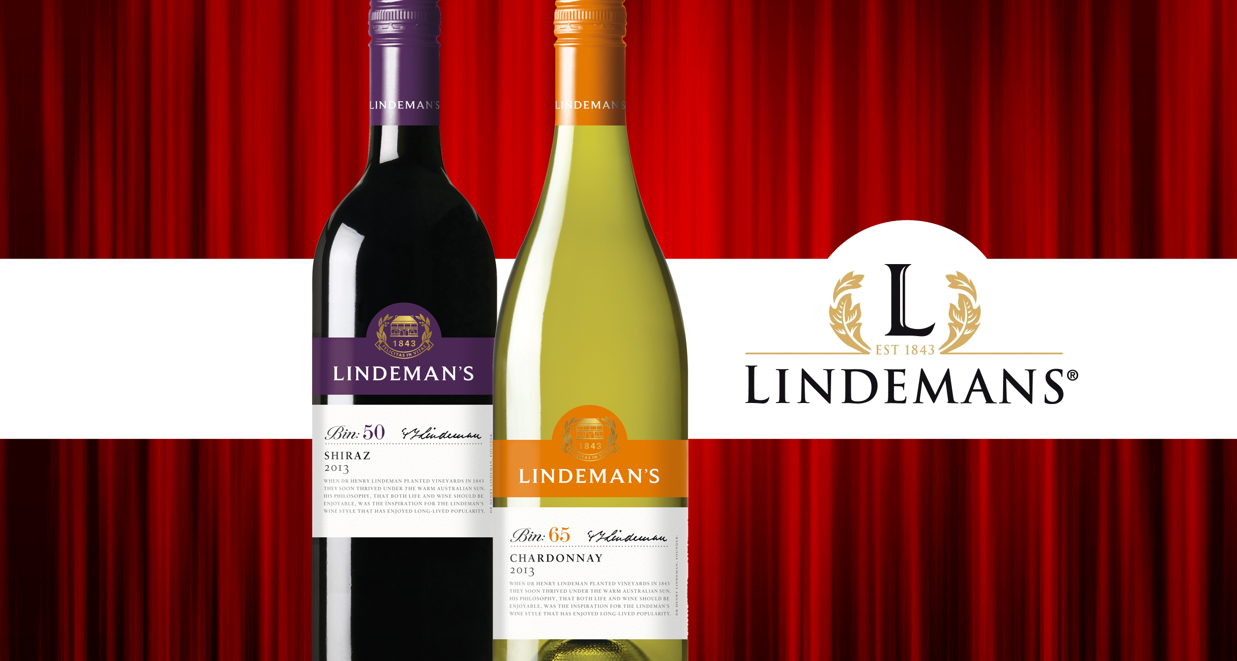
Wine firm Treasury Wine Estates will be rolling out a new brand identity for its leading Lindeman’s brand in the first quarter of 2015. This will include a new logo and packaging which the company says will offer greater clarity for shoppers by bringing synergy to the brand family, whilst also giving clear differentiation between the ranges.
All labels across the range will be modernised to make them easily identifiable on shelf for shoppers and the colours of the Bin Series tier, a fundamental part of the range identity, have been updated to a more vibrant and appealing colour palette.
Mathew Bird, Marketing Director EMEA at Treasury Wine Estates commented: “Lindeman’s remarkable global popularity has been driven by the simple and personal philosophy of Dr Henry Lindeman who planted the first Lindeman’s vines in the Hunter Valley in 1843. Through the launch of the new brand identity, we’re looking to champion the fundamental brand values of Lindeman’s – heritage, home and happiness, in everything we do.”
Bird continued: “This fresh new brand identity and look for Lindeman’s will deliver greater stand out on shelf with clearer and more impactful packaging, making it easier to spot for shoppers which will ultimately drive more sales for retailers when it arrives in store next year.”